
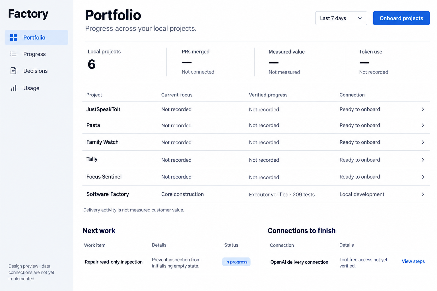
Implementation reference: portfolio concept, 1536 × 1024. This is a visual specification; its example facts are historical, not live data. Behaviour and acceptance govern the data and interactions.
Tokens
Canonical values: docs/brand/tokens.json, from the design system Factory · Plumb; design language says where they go and how to re-sync.
Use the system sans-serif stack, white canvas, near-black text (#080d1a), muted slate (#58627b), cool grey rail (#f3f6fa), light dividers (#dce2ec), blue action (#075bea) and pale blue selection (#dceaff). Confirm colours against the rendered concept during browser QA. Avoid gradients and raised cards. The only imagery is the reviewed brand artwork below.
At the reference width: 258px navigation rail, 40px main inset, 48px page title, 24px subtitle, 26px section headings, 18px body/control text, 16px supporting text. Use weights 400/500/650/750 and line height 1.4; titles 1.1. Spacing follows 4/8/12/16/24/32/40/48px. Controls are 48px high with 6px corners; selection rows have 8px corners. Focus rings must remain visible.
Components
- Navigation: Factory mark and wordmark; Portfolio, Progress, Decisions, Usage. Simple 20–24px icons with consistent stroke; selected item blue on pale blue. Each destination must have a working view before appearing.
- Page header: title/subtitle left; reporting period and primary action right. Primary label reflects the available command. Already authorised onboarding proceeds without an approval queue.
- Metric strip: open columns divided by fine vertical rules, label/value/provenance. Unknown uses an em dash plus its specific reason; confirmed zero displays 0. The period applies only to period-based metrics; the project count is explicitly current.
- Project table: four main columns: Project, Current focus, Verified progress, Connection. Fine horizontal separators, no striped fill. Whole-row navigation has an accessible link and visible keyboard focus. Details retain source, observation time and exact evidence.
- Work and connections: two open lists beneath the table; concise item, explanation and status or next action. No fabricated blocked work or hardcoded historical test count.
- Decision/repair view: one focused panel with objective, concrete options or recovery steps, recommendation when justified, evidence disclosure and an actual submit/recheck action. Additional state concepts precede implementation of these views.
Brand
Per branding; references in brand.ts.
- Mark beside the live-text wordmark: decorative (
alt=""), canvas 72/64/56 px by layout, never below 48 px. The favicon is unchanged; the mark is not an approved favicon. - Plumb, 128 px, decorative, below the brand guide's line and a plain detail in the empty Portfolio, only on a successful current read with no action, notice, source problem or running or failed check (
calmEmptyPortfolio). Otherwise the same words appear without it. Not a control; no motion. - No "No decisions need you": no source records owner decisions yet, so data cannot confirm it.
Byte-identical copies in apps/dashboard/public/brand, checked by test/dashboard-brand.test.ts:
| Published | Source | SHA-256 |
|---|---|---|
/brand/factory-mark.png | docs/brand/assets/core/factory-mark.png | cdaaffc0f97a7dfdd49c03f6b85ebb0247832045801c75b5064da2fdc227ecc0 |
/brand/plumb-mascot.png | docs/brand/assets/core/plumb-mascot.png | 1a3b94799d0d1bbc77a5b5b27a6d8d7bc9663c6f5605f13782e29efbe0038644 |
Responsive and accessible behaviour
At narrow widths replace the rail with labelled compact navigation, stack header controls and lower lists, and use a two-column metric strip. Keep project identity and progress visible; expand a row for supporting fields. Do not clip long names, values or recovery instructions. Use semantic headings, tables, form labels and live status messages; honour reduced motion. Aim for WCAG AA contrast and 44px minimum touch targets.
Copy and evidence
Fixed copy: Factory; Portfolio; Progress across your local projects.; Progress; Decisions; Usage; Local projects; PRs merged; Measured value; Token use; Project; Current focus; Verified progress; Connection; Next work; Connections to finish; Delivery activity is not measured customer value.
Product names and all counts, dates, statuses, focus, progress, controls and recovery instructions come from validated domain data or available capabilities. Record intentional data/capability differences from the concept in the fidelity ledger. Remove “Design preview” only when the UI is connected and verified; show real capture time/freshness instead. Never present the generated screenshot as the running dashboard.
Acceptance requires desktop/mobile browser interaction, source-to-view checks, retained screenshots and comparison against the concept for copy, layout, typography, palette, spacing and responsive behaviour. Displayed decisions use the same contracts as other callers; projection reads never execute work.