
Factory's design language is the design system Factory · Plumb, iterated in Claude Design (version 1790613544-ec35, synced 2026-09-28). Its link is recorded in the Notion status, not here. tokens.json is the repository's canonical copy, byte for byte as the design system exported it.
Brand guide · Dashboard design · Vector geometry · Brand assets
What the tokens hold
- 20 colours, one light theme.
ok,warnandproblemmean status only, always beside a word, and never appear in artwork. - Two families,
sansandmono, both system stacks, with 21 type styles in three groups: Display, Text and Code. - Spacing
space-1tospace-12(4 to 48 px), radiiradius-sm,radius-mdandradius-lg(4, 6 and 8 px), thefocusring (the only shadow) and layout and brand sizes such asrail-width,inset,control-height,touch-min,mark-minandillustration. - Responsive values at 1280 and 960 px live in each token's usage note and in the stylesheets, not as separate tokens.
The rules for voice, colour, type, layout, the mark, Plumb, icons and accessibility are in the pages above; the tokens carry values only.
Where the tokens go
Dashboard.
apps/dashboard/src/styles.cssdeclares:rootcustom properties under the token names (--ink,--blue,--rail-width,--inset,--focusand the rest); other palette colours appear there as literal values. The tokens were read from this stylesheet, so names match.Docs site.
scripts/build-docs-site.tsreads this file at build time and generates the token block ofsite/assets/site.css: every colour, spacing, radius, shadow and size token as a:rootcustom property, the two families as--font-sansand--font-mono, a.type-<name>class for each type style, and the 1280 and 960 px values the usage notes state. Every other rule refers to those properties, so the token block holds the only colour literals. The design system has no token for a reading measure or a minimum width, so the builder names six site measures once (SITE_MEASURES: the 70ch reading measure, as in the dashboard, the narrowest page, table, wide table, diagram and module card); every other length is a token or a 1 to 3 px line or offset. The builder stops on a second theme, a font file, a value it cannot carry, or a token that takes a site measure's name.Docs site layout. As in the dashboard: a
rail-widthnavigation rail with the mark fromfactory-mark.pngbeside the live wordmark (mark-lg,mark-mdormark-sm, never belowmark-min), the main column inset byinset, and a top bar at 960 px and below. The mark and the dashboard'sfavicon.svgare copied byte for byte. Module status is a word in a badge: Accepted and In progress on the default badge, Planned quiet. The site shows no stale, blocked or failed state, so it uses nook,warnorproblemcolour. Limits, what is not established and the reference pages' note are notices. Plumb appears on the home page below its words with empty alt text. Module pages show their whole plate, up to 768 px wide so its labels stay legible. The Design page ends with the decision-domain studies as text, and its note says the site added that section.Diagrams and PDFs.
scripts/render_docs.pyreads the colours and thesansfamily from this file for the six architecture diagrams indiagrams/and the four PDFs inoutput/pdf/:inkandmutedtext,railboxes (selectfor stores) withruleedges,mutedarrows,bluelinks, and weights 400, 650 and 750. The PDFs embed Arial, a member of thesansstack, because a PDF needs a font file. The hand-drawn module map uses the same tokens.test/design-tokens.test.tsreads both stylesheets and the drawings with allow-lists, so a value it does not know fails:- Colour. Palette colours only, in any CSS syntax: every named, system or escaped colour fails. A property that takes a colour holds only palette colours,
transparent,currentcolorand its own keywords. No gradient, recolouring filter or blend mode. A dashboard variable named after a token equals it. - Type. The
sansormonofamily. Every font property,line-heightandletter-spacingtakes a type token's value; any other font property fails, exceptfont-smoothing: antialiased. Thefontshorthand only asfont: inherit. - Radius, spacing, shadow and outline. Every radius property (each corner, physical or logical, both axes) takes radius tokens. Every margin, padding and gap is on the spacing scale; the dashboard also keeps its 26 listed values. Every shadow is
none, andbox-shadowmay befocus.outlineisnoneor3px solid var(--blue),outline-offsetis2pxor-3px, and other outline properties fail.calc()appears only in the forms the test lists, on the properties that use them: the mark's clear space in both stylesheets, and the site's skip link, plate width and sticky navigation height. Any other math function fails. Every other site dimension (in any unit) and percentage is a token, a site measure or a listed structural value: 1 to 3 px lines, the underline offset,100vh,100%,50%and1fr. The site uses no function beyondvar(), thosecalc()forms, and the grid, clip, transform andattr()functions it needs. - Variables and resets. A custom property is declared only on
:rootfor a token (the site adds its font stacks and measures), on:rootin a singlemax-widthquery at a breakpoint the token's note names (only the rail width and inset change, to the notes' values), or as--markon.wordmark(the mark token for that width, never belowmark-min), each width's value once and in order.var()names only those, with no fallback. No CSS-wide keyword butinherit, and noall. - Scheme, at-rules and escapes. Light only; no at-rule but
@media; no CSS escape (a backslash) outside a string, so no property, function, unit or keyword hides behind one. The test reads CSS through a tokenizer that follows CSS Syntax Module Level 3 and re-serialises both stylesheets byte for byte, so a comment delimiter inside a string orurl()never hides a rule. CSS it cannot read as a browser would fails: a bad string orurl(), an unclosed block or comment, or a nested rule. Every check also reads escapes decoded, as the browser would. - Drawings in
docs/diagrams/anddocs/guide/: the same colour, family, weight, reset and escape rules, with nocurrentColor, custom property orvar(), and<style>as plain CSS (no CDATA, XML comment or character reference). Every shape and text fills from a palette value, its own or inherited. Only static shapes, text, groups and markers, with no at-rule, processing instruction or reference outside the file. Every attribute is one the drawings use: structure and geometry take plain values. The presentation attributes arefill,stroke,stroke-width,stroke-dasharray,font-family,font-size,font-weightandtext-anchor, plusletter-spacingandmarker-endin<style>, each read with the stylesheets' declaration checks. Any other attribute or presentation property fails, such asfilter,opacity,transform,clip-pathormask.
Mutation cases alter copies in memory to show each rule failing. The test lists any dashboard colour variable that has no token.
test/docs-site.test.tschecks the site's use of these rules on every page.- Colour. Palette colours only, in any CSS syntax: every named, system or escaped colour fails. A property that takes a colour holds only palette colours,
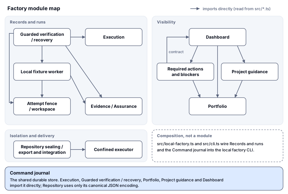
Re-syncing
Either the owner starts /design-sync, or by hand:
- Copy the design system's exported tokens over
docs/brand/tokens.jsonwithout editing them. - Run
node --test test/design-tokens.test.tsand bring any dashboard value it names into line, or report the difference to the design system. - If a colour or the
sansfamily changed, regenerate the diagrams and PDFs withpython3 scripts/render_docs.py(it needs ReportLab and pypdf). - Rebuild the site with
rm -rf site && npm run docs, then runnpm run checkand, for the dashboard,npm --prefix apps/dashboard run check.
Not covered yet
- No dark theme. The design system is light only, so the dashboard and the docs site render light only. The docs site's earlier dark-mode rules were removed, not given invented colours. A dark palette needs new tokens from the design system first.
- No font files. Both families are system stacks.
- No measure tokens. Reading measures and minimum widths are not tokens. The dashboard sets its own (60 to 90ch and fixed widths); the docs site names six in
SITE_MEASURES. Tokens from the design system would replace both. - The dashboard's in-between spacing. The dashboard's stylesheet is also the design system's component bundle, copied verbatim, and 26 of its margins, paddings and gaps sit between the spacing steps (for example 20, 28 and 36 px). The test lists them and fails on any new one; they change only when the design system changes them.
- Other dashboard lengths. Positions, border widths and element sizes in the dashboard are not on a scale; the rules above cover its colour, type, radius, spacing, shadow and outline. The site's other lengths are tokens or site measures.
- Opacity.
opacityis not checked: the dashboard's disabled states (0.7 and 0.45) blend palette colours with the canvas, so they render tints outside the palette. A disabled-state token from the design system would replace them. - Brand artwork. The checks read stylesheets and drawings as text. The brand artwork (the mark, the favicon, the lockup and the plates) keeps its reviewed bytes and is not read by them.
- The static lockup's stack.
factory-lockup.svgkeeps its reviewed bytes (provenance), so its text namesHelveticawhere thesanstoken names'Helvetica Neue'. Changing it needs a new review and provenance record.